The Symplicity Brand:
A set of values, attributes and artwork that reflects our company mission
2025 EDITION

This comprehensive branding guide showcases how to effectively implement our brand's visual elements
This guide provides detailed instructions on utilizing our logos, colors, typefaces, and other visual elements. Consistently following these guidelines strengthens our position as the industry leader in higher education, government, and corporate solutions.
Parent Brand
Symplicity stands at the forefront of employability readiness, backed by our impactful visual identity that reinforces our position as industry leaders. By consistently utilizing the Symplicity identity, we strengthen recognition of our brand and visually reinforce our reputation of innovation, reliability, and integrity.
The parent brand primary logo is the preferred usage for partnerships, co-branding, and in media articles.
Always display the Symplicity parent brand logo prominently without interference from other graphic elements such as photographs, illustrations, body text, or frame boundaries such as, on a Web page.
Certain display requirements have been established to prevent competition from other graphic elements. These minimum requirements identify the amount of clear space that must surround the Symplicity parent brand logo.
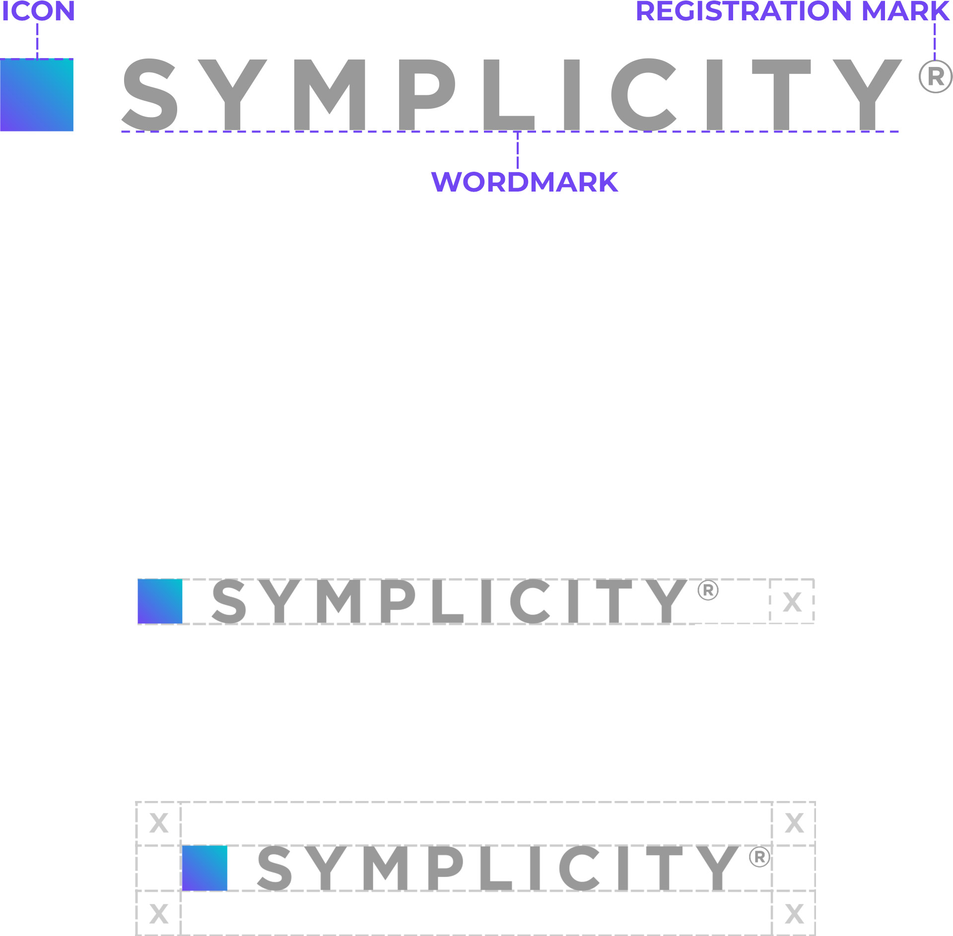

The Symplicity logo should be easy to distinguish from its background
When the logo is placed on a background where the tonal value of the background is darker than a 40% screen of black, the reverse use is applied. Do not display the Symplicity parent brand logo on conflicting backgrounds, e.g., bold or busy patterns, photographs, illustrations, etc...
Parent Logo Variations

Primary

White/reverse
Use on backgrounds darker than 40% black, including flat and photographic backgrounds

Dark
Use only on photographic backgrounds that are lighter than 40% black

Gradient
Used only in marketing materials when logo is the largest, most prominent element in the material

Gray
For watermarks on light backgrounds when the logo is not the main focus

Blue
Used only when screen printing where vendor limits require a one color logo, but color is preferred

Basic Color
For operational purposes such as invoices, stationary, envelopes, and email signatures
Product logos
Proper and consistent implementation of our product logos is essential to uphold the core values of the Symplicity brand.
Each Symplicity product has its own logo, consisting of two elements: the Symplicity wordmark and the product descriptor. For each logo, use only approved variations.
Like the Symplicity parent brand logo, always display product logos prominently without interference from other graphic elements such as photographs, illustrations, body text, or frame boundaries such as, on a Web page. Do not alter product logos in any way.
Certain display requirements have been established to prevent competition from other graphic elements. These minimum requirements identify the amount of clear space that must surround Symplicity Product Logos.
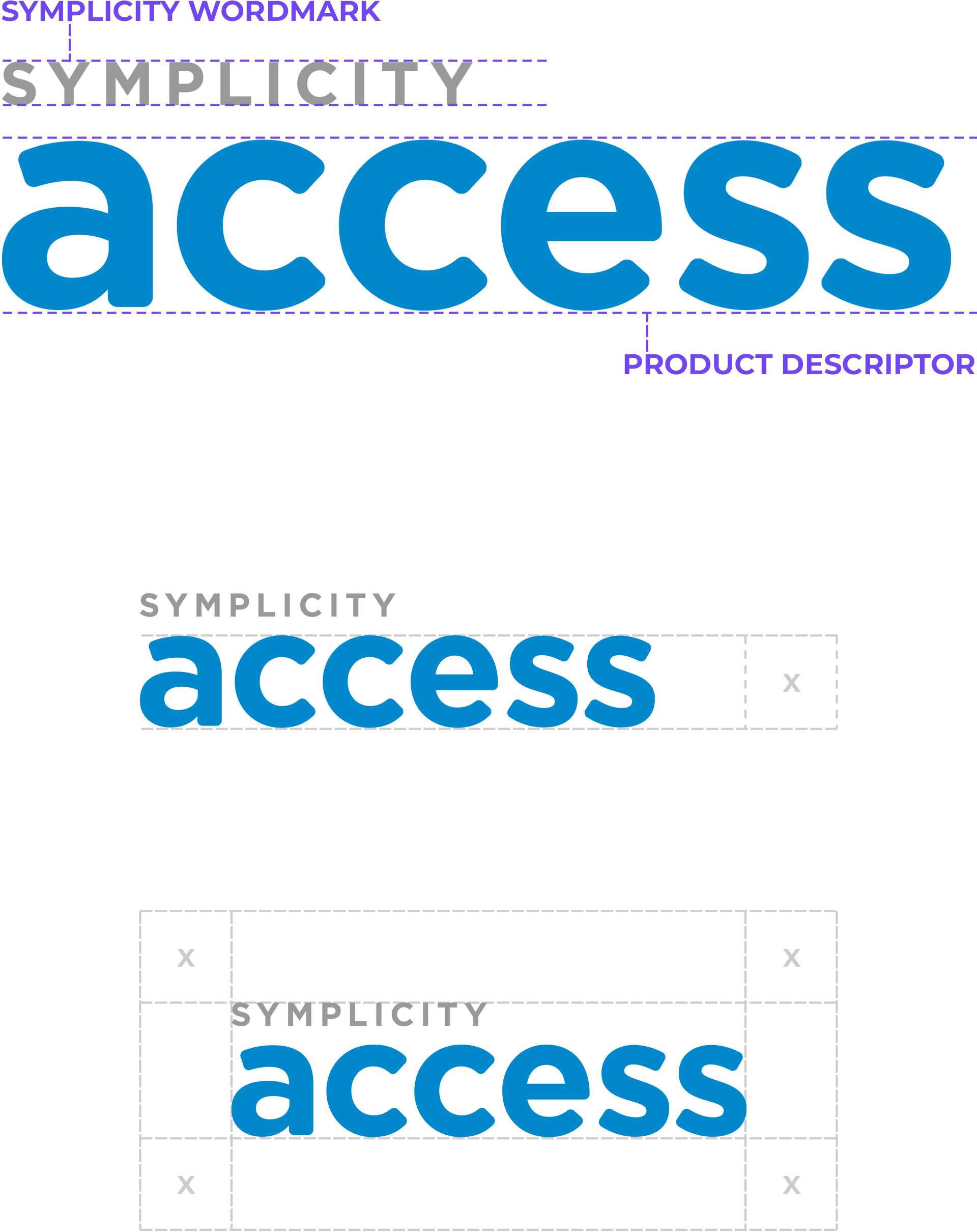
Product Logo Variations

Primary

Gray
Use as a watermark on light backgrounds, when the logo is not the main focus

Dark
Use only on photographic backgrounds that are lighter than 40% black

White/reverse
Used on backgrounds darker than 40% black, including flat and photographic backgrounds
Squares
The Symplicity Square stands as a symbol of our brand, embodying the values of integrity, strength, and reliability.
Like our other logos, always display squares prominently without interference from other graphic elements such as photographs, illustrations, body text, or frame boundaries such as, on a Web page. Do not alter squares in any way.
Certain display requirements have been established to prevent competition from other graphic elements and to ensure legibility. These minimum requirements identify the amount of clear space that must surround Symplicity Product Logos and provide minimum size requirements. Squares should only be used when the display size is greater than 1.5" or 200px.

Square Variations
Solid



Primary
Blue
Use only when screen printing where vendor limits require a one color logo, but color is preferred
Dark
Use only on photographic backgrounds that are lighter than 40% black

White/reverse
Used on backgrounds darker than 40% black, including flat and photographic backgrounds

Primary
Blue
Use only when screen printing where vendor limits require a one color logo, but color is preferred
Dark
Use only on photographic backgrounds that are lighter than 40% black

White/reverse
Used on backgrounds darker than 40% black, including flat and photographic backgrounds
Outline


Brand Colors
Primary
symplicity blue
HEX #0088CC
RGB 0 • 136 • 204
CMYK 81 • 36 • 0 • 0
PANTONE PROCESS BLUE C
Tints
80%
#CCE7F5
60%
#99CFEB
40%
#66B8E0
20%
#33A0D6
shades
20%
#006DA3
40%
#00527A
60%
#003652
80%
#001B29
Secondary
Violet
HEX #7146F2
RGB 113 • 70 • 242
CMYK 67 • 73 • 0 • 0
PANTONE 266 C
Tints
80%
#E3DAFC
60%
#C6B5FA
40%
#AA90F7
20%
#8D6BF5
shades
20%
#5A38C2
40%
#442A91
60%
#2D1C61
80%
#170E30
Tertiary
Teal
HEX #00C4CE
RGB 0 • 196 • 206
CMYK 92 • 0 • 23 • 0
PANTONE 3115 C
Tints
80%
#CCF3F5
60%
#99E7EB
40%
#66DCE2
20%
#33D0D8
shades
20%
#009DA5
40%
#00767C
60%
#004E52
80%
#002729
Grays
Light Gray
HEX #F5F5F5
RGB 245 • 245 • 245
CMYK - • - • - • -
Mid Gray 01
HEX #E7E7E7
RGB 231 • 231 • 231
CMYK - • - • - • -
Mid Gray 02
HEX #CCCCCC
RGB 204 • 204 • 204
CMYK - • - • - • -
Mid Gray 03
HEX #999999
RGB 153 • 153 • 153
CMYK - • - • - • -
Dark Gray
HEX #233748
RGB 35 • 55 • 72
CMYK - • - • - • -
Gradient Palette
The Symplicity brand utilizes a gradient created from the brand colors for a variety of color options. On top of the brand colors, all gradient colors are also approved for use in Symplicity branded materials.
The Symplicity Gradient
teal
teal 02
HEX #00B5CD
teal 03
HEX #00A6CD
teal 04
HEX #0097CD
Symplicity blue
Blue 02
HEX #1B78D6
Blue 03
HEX #3967E0
Blue 04
HEX #5557E8
violet
Violet 02
HEX #7F3FEE
Violet 03
HEX #8E38EA
Violet 04
HEX #9C31E6
Montserrat is used for typography in Symplicity's marketing experiences.
The inspiration for this geometric sans serif font came from posters and signs found in the historic Montserrat neighborhood of Buenos Aires. It was designed as a typeface that brings the beauty of urban typography from the first half of the twentieth century to the modern era. The Montserrat typeface is modern, simple, and strong, while remaining timeless and dependable.
Montserrat is an open source Google font
Heading - XXL
Heading - XL
Heading - L
Heading - M
Heading - S
Heading - XS
Heading - XXS
Body - L
Body - M
Body - S
Body - XS
Stock Photography
Photography is a major component of the Symplicity brand identity and it is important to choose the right photo for the project you are working on. When choosing stock photography, your selections should feel authentic, candid, colorful, diverse, and professional. The guidelines below will help you select images that support these themes.
Tips for choosing the right stock photos
The Text-Friendly Image
Choose images with adequate space to place text appropriately. Avoid text over faces.
The Perfect Shot
Try to steer away from the cheesy generic stock photo options ( ex. the corporate handshake, random smiling employees). The more authentic and candid the better.
Find images that portray depth to create a great sense of interest and quality. Rather than a more traditional angle, images with unique perspective/angle (ex. bird’s eye view) can also create added dynamism.
The Audience
Depending on the audience, choose images that are hip and cool while still maintaining that corporate look and feel.
The Lighting
Lighting plays a huge role in choosing the perfect image. Depending on the subject matter, the lighting can range from soft and subtle to bold and dramatic. Choose images with contrast between the shadows and lit areas.
The Orientation
Choose a photo that will crop well to whatever proportion you are working with. Make sure when cropping photos that everything in the selected crop area is identifiable and there are no weird unidentifiable subjects within the image.





Color Overlays
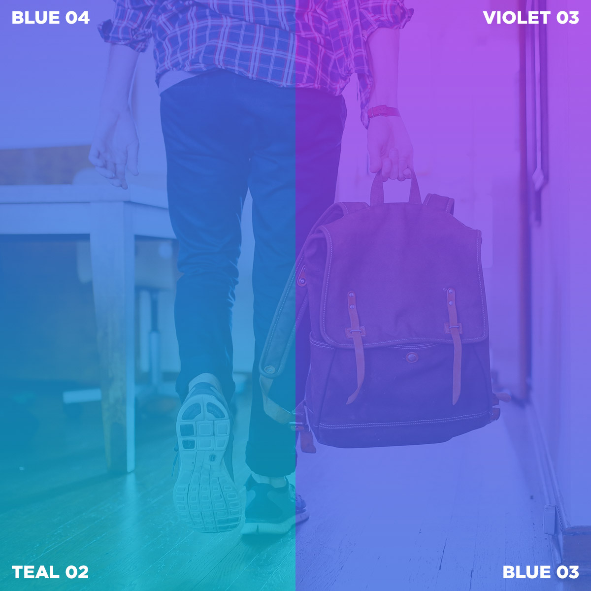
Add a splash of color to your background images by applying color or gradient overlays. Overlays help create a dynamic and textured background to draw attention to your messaging. Please consult the guidelines below to maximize the effectiveness of your overlays.

DO:
Use the symplicity gradient at an opacity of 80%
DO:
Use other gradients from gradient colors at an opacity of 80%

DO:
Use colors from the symplicity gradient at an opacity of 80%

DO:
Use a solid black overlay at an opacity of 50%

DON't:
Use different opacities in one gradient overlay

DON't:
Use other percentages for overlays (except black)

DON't:
Use photoshop's blend modes other than normal/pass through

DON't:
Use colors selected from outside the parent brand

Branded Overlay Imagery: The Campus
In addition, Symplicity regularly utilizes "The Campus", a branded graphic in multiple variations of our distinctive brand gradient to enhance the visibility of messaging. If you are interested in using these graphics, please reach out to Symplicity Marketing.
Line King
Our primary icons for all marketing materials draws from the Line King icon set. This set provides detailed, yet simple icons which coincide with our branding overall.
We absolutely understand that it isn’t always feasible or necessary to use this exact set, so other icons similar in visual style (outline) are permitted.

